📊 Anthropic released Claude Dashboards and Claude Motion - now Claude can create live dashboards and animated explanations.
Dashboards work like this: you ask a question about company data in plain language ("how do sign-ups this week compare to last month") - and Claude assembles an interactive dashboard that updates with the data. You can view the query that built each graph, so there's no magic under the hood, everything is verifiable. It connects to Redshift, BigQuery, ClickHouse, Databricks, Snowflake, and Salesforce, and the finished dashboard can be exported to Grafana, Hex, Mixpanel, PostHog, Sigma, and several other BI tools.
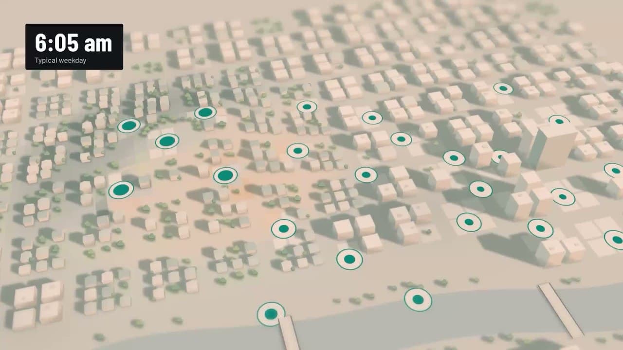
Motion turns ideas into animated explanations - for a quarterly report, a presentation with animated graphs, or a product demo. An important detail: this is not a video model, but animation in code, so there are no generated images and no AI people - just honest animation that can be edited and exported to MP4.
Both features are currently in beta: Dashboards on paid plans, Motion only for Team and Enterprise. Meanwhile, Docs, Slides, and Design have exited beta and are now available on all plans, including the free one.
https://claude.com/resources/articles/dashboards-and-motion
#anthropic@rvnikita_blog #claude@rvnikita_blog #ai@rvnikita_blog #dataviz@rvnikita_blog